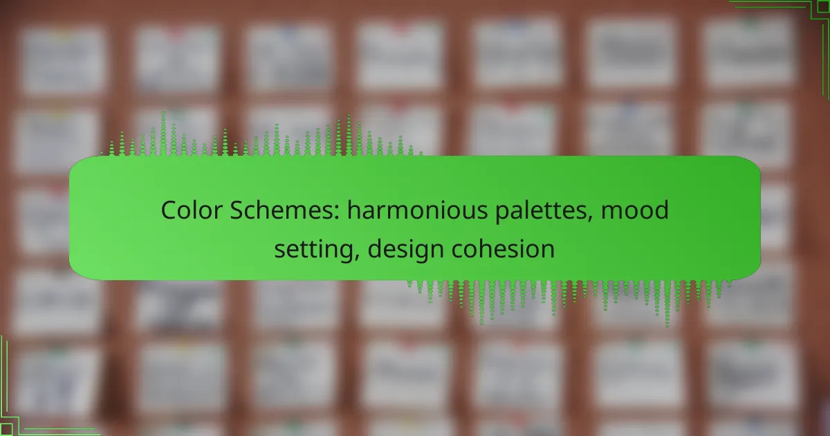
Color schemes play a crucial role in home design, as they not only enhance visual appeal but also influence mood and cohesion. By selecting harmonious palettes and understanding the emotional impact of different hues, designers can create spaces that evoke specific feelings and foster a cohesive aesthetic. A well-thought-out color strategy ensures that all design elements work together seamlessly, enhancing the overall experience.

How to choose harmonious color schemes for home design?
Choosing harmonious color schemes for home design involves understanding color relationships and how they affect mood and cohesion. Start by identifying a base color and explore combinations that enhance the overall aesthetic while creating a desired atmosphere.
Color wheel fundamentals
The color wheel is a visual representation of colors arranged according to their chromatic relationship. It is divided into primary, secondary, and tertiary colors, providing a foundation for creating harmonious palettes. Understanding the wheel helps in selecting colors that work well together.
Primary colors (red, blue, yellow) can be mixed to create secondary colors (green, orange, purple), while tertiary colors are formed by mixing primary and secondary colors. Familiarity with these relationships aids in making informed design choices.
Complementary color combinations
Complementary colors are located opposite each other on the color wheel, creating a striking contrast when paired. This combination can energize a space, making it visually dynamic. For example, pairing blue with orange can create a vibrant atmosphere.
When using complementary colors, balance is key. Too much contrast can be overwhelming; consider using one color as the dominant shade and the other as an accent to maintain harmony.
Analogous color schemes
Analogous color schemes consist of colors that are next to each other on the color wheel, such as blue, blue-green, and green. This approach creates a serene and cohesive look, ideal for spaces meant for relaxation, like bedrooms or living rooms.
To implement an analogous scheme, select one dominant color and use the others as accents. This method allows for subtle variations while maintaining a unified feel throughout the design.
Triadic color palettes
Triadic color palettes use three colors that are evenly spaced around the color wheel, such as red, yellow, and blue. This scheme offers a balanced and vibrant look, suitable for playful or creative spaces like children’s rooms or art studios.
When applying a triadic palette, choose one color as the primary focus and use the others for accents. This balance prevents any one color from overpowering the others, ensuring a harmonious design.
Monochromatic color usage
Monochromatic color usage involves variations of a single color, including different shades, tints, and tones. This approach creates a sophisticated and cohesive look, making it suitable for modern and minimalist designs.
To effectively use a monochromatic scheme, incorporate textures and patterns to add depth and interest. This can prevent the space from feeling flat and enhance the overall aesthetic.

What are the best color palettes for mood setting?
The best color palettes for mood setting depend on the emotional response you want to evoke. Choosing the right colors can significantly influence feelings and behaviors, making it essential to understand how different hues affect mood.
Warm colors for energy
Warm colors, such as reds, oranges, and yellows, are known for their energizing effects. These hues can stimulate excitement and increase enthusiasm, making them ideal for environments where activity and interaction are encouraged.
When using warm colors, consider their intensity and saturation. Bright, vibrant shades can create a lively atmosphere, while softer tones can provide warmth without overwhelming the space. For example, a bright orange accent wall can invigorate a room, while a muted peach can create a cozy feel.
Cool colors for calmness
Cool colors, including blues, greens, and purples, promote a sense of tranquility and relaxation. These shades are often used in spaces designed for rest, such as bedrooms or meditation areas, as they can help reduce stress and anxiety.
Incorporating cool colors can be done through paint, decor, or textiles. A soft blue can evoke a serene environment, while a deep green can connect the space to nature. Aim for lighter shades for a more airy feel, or deeper tones for a more intimate atmosphere.
Neutral colors for balance
Neutral colors like whites, grays, and beiges serve as a foundation for design, providing balance and versatility. They can complement both warm and cool colors, making them ideal for creating cohesive palettes.
Using neutrals effectively can enhance the overall aesthetic without overpowering other colors. For instance, a light gray can ground a vibrant room, while a warm beige can add a touch of comfort. Consider layering different textures in neutral tones to add depth without introducing competing colors.
Bold colors for creativity
Bold colors, such as bright pinks, vivid greens, and striking blues, can stimulate creativity and innovation. These colors are often used in creative workspaces or areas meant to inspire new ideas.
When incorporating bold colors, use them as accents rather than dominant hues to avoid overwhelming the space. A few strategically placed colorful items, like artwork or furniture, can invigorate a room and encourage imaginative thinking. Balance bold colors with neutrals to maintain a harmonious environment.

How to achieve design cohesion with color schemes?
Design cohesion with color schemes is achieved by maintaining a consistent application of colors, establishing a clear hierarchy, and using accent colors strategically. This approach ensures that all elements of a design work harmoniously together, enhancing the overall aesthetic and user experience.
Consistent color application
Consistent color application involves using a defined palette throughout your design to create a unified look. Choose a primary color and a few complementary shades to maintain visual harmony. For example, if your primary color is blue, consider using lighter and darker shades of blue for backgrounds and text.
To ensure consistency, create a style guide that outlines the specific colors, their uses, and any variations. This guide will help you avoid mismatched colors that can disrupt the flow of your design.
Color hierarchy in design
Establishing a color hierarchy means using color to guide users’ attention to the most important elements. Use bolder, brighter colors for key features like call-to-action buttons, while softer tones can be used for background elements. This contrast helps users navigate your design intuitively.
Consider employing a three-tiered approach: primary colors for main actions, secondary colors for supporting elements, and neutral colors for backgrounds. This method ensures that users can easily distinguish between different levels of importance within your design.
Using accent colors effectively
Accent colors should be used sparingly to draw attention to specific areas without overwhelming the viewer. Select one or two accent colors that complement your primary palette and use them for highlights, buttons, or important text. This technique can create focal points that enhance user interaction.
A good rule of thumb is to use accent colors for no more than 10-15% of your overall design. This keeps the focus on your primary colors while still allowing for visual interest and engagement. Avoid using too many accent colors, as this can create a chaotic appearance and detract from cohesion.

What tools can help create color schemes?
Several tools can assist in creating effective color schemes, making it easier to select harmonious palettes that enhance design cohesion. These tools offer features for generating, testing, and refining color combinations to suit various moods and themes.
Adobe Color for palette generation
Adobe Color is a versatile tool that allows users to create color schemes based on various color rules such as complementary, analogous, and triadic. You can generate palettes by selecting a base color and adjusting the sliders to explore different shades and tones.
Additionally, Adobe Color offers the option to extract color themes from images, which can be particularly useful for designers seeking inspiration from real-world visuals. This feature helps in maintaining a cohesive look by aligning color choices with existing elements.
Canva color palette tool
Canva’s color palette tool is user-friendly and ideal for quick palette creation. Users can input a color code or select a color from the palette, and Canva will generate a harmonious color scheme that complements the chosen color.
This tool is particularly beneficial for non-designers, as it simplifies the process of finding colors that work well together. Canva also provides pre-made color palettes inspired by popular trends, which can save time and enhance creativity.
Coolors for quick color combinations
Coolors is a fast and intuitive tool for generating color combinations. Users can start with a random palette and lock in colors they like, allowing the tool to generate new combinations around those selections. This feature is great for brainstorming and experimenting with different looks.
Coolors also offers a color blindness simulator, which helps ensure that your color choices are accessible to all users. This consideration is crucial in creating designs that are inclusive and effective across diverse audiences.

How do cultural contexts influence color perception?
Cultural contexts significantly shape how individuals perceive and interpret colors. Different societies associate specific colors with distinct meanings, emotions, and traditions, which can affect design choices and branding strategies.
Color meanings across cultures
Colors carry various meanings depending on cultural backgrounds. For example, while white is often associated with purity and weddings in Western cultures, it may symbolize mourning in some Eastern societies. Understanding these associations is crucial for effective communication through design.
In many African cultures, red can signify strength and vitality, whereas in some Asian cultures, it represents luck and prosperity. Designers must consider these meanings when creating visuals for diverse audiences to avoid misinterpretation.
Regional color preferences
Regional preferences for colors can vary widely, influenced by factors such as climate, environment, and local traditions. For instance, vibrant colors are often favored in tropical regions, while muted tones may be more popular in colder climates. This can affect product design and marketing strategies.
In Europe, pastels are commonly preferred for fashion and home decor, while in the Middle East, bold and rich colors are often used in textiles and architecture. Understanding these regional preferences helps designers create more appealing and culturally relevant products.

What are emerging trends in color schemes for 2024?
In 2024, color schemes are leaning towards natural palettes that evoke emotion and connection. Designers are increasingly focusing on harmonious combinations that enhance mood and cohesion in various settings.
Earthy tones resurgence
Earthy tones are making a strong comeback in 2024, reflecting a desire for grounding and stability in design. Colors like terracotta, olive green, and muted browns are being favored for their ability to create a warm and inviting atmosphere.
When using earthy tones, consider pairing them with lighter shades to maintain balance. For instance, combining a deep olive with a soft beige can create a soothing visual experience. This approach works well in both interior design and branding, where a natural feel is desired.
To effectively incorporate earthy tones, aim for a palette that includes 2-3 main colors and a few accent shades. Avoid overwhelming the space with too many dark hues; instead, use them strategically to highlight key areas or features. This method ensures a cohesive and harmonious design that resonates with viewers.